
Color is tremendously powerful in creating data visualizations.
Tableau allows you to create custom color palettes. And usually people do this by:
- Find an image with the colors you want to use
- Use an eyedropper color picker tool; select each color in the image.
- Get the color code.
- Open your preferences.tps file and write a line of XML by hand that includes the color code.
- Repeat for each color.
But that’s old-school. One of my colleagues created a web app that automatically creates custom Tableau color palettes from any image.
- Find the URL of an image with the colors you want to use
- Paste it into http://www.tabpal.co/
Tabpal identifies the dominant colors and spits out custom palette information ready to add to your Tableau prefs. Done!
For example, say I wanted to make a viz about the history of Apple, using the color scheme of Apple’s old rainbow apple logo.

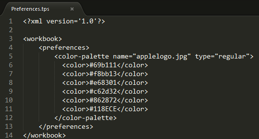
I fed it to TabPal. Here’s what I get:

TabPal grabs the top five colors in the image, identifies them, and creates the color-palette XML I need.
But, we’re not quite done yet. The Apple rainbow has six colors, so I used a web color picker (I like Colorzilla) to identify the blue color’s hex code — it’s #118ECE — and added it to the list TabPal generated, then added it to my Tableau preferences file.
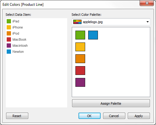
Now I can make my Apple viz in six colors. Moof!
Interested in learning more? Check out this webinar on Best Practices for Using Color in Data Visualization by Tableau Research Scientist Maureen Stone. She’s wicked smart!

Leave a comment